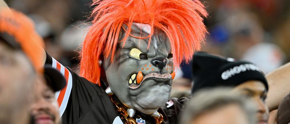
How can you not love the Browns’ Dawg Pound?
The Cleveland Browns unveiled a new dog logo Monday, created by Houston Mark and chosen by fans in a vote.
If you just take a simple look at the logo, it looks like a regular dog. However, there’s “more than meets the eye” in this design. Mark featured several hidden images in the logo, which are meant to represent both Cleveland‘s fanbase and the history of the franchise.
To sum it all up, an outline of Ohio is drawn in the dog’s ear, it’s nose is a football, the dog’s collar features both the east end zone and a guitar pick (which represents the Rock and Roll Hall of Fame in Cleveland), the team’s “intensity” is the spikes, Cleveland’s Hope Memorial Bridge is installed under the jowls, one of the dog’s eyebrows is the Browns‘ classic pound helmet and between the dog’s eyebrows is the team’s helmet stripe.
and the winner is…
Introducing our new official dog logo!! 🐾🎉 #DawgPound pic.twitter.com/zny6NxobHy
— Cleveland Browns (@Browns) June 12, 2023
more than meets the eye 🧐🦴 pic.twitter.com/iwJ7i1kN6a
— Cleveland Browns (@Browns) June 12, 2023
City Connects in MLB, City Editions in the NBA and now the NFL is starting to do the same thing. And I’ve always been a fan of the marketing that connects a franchise with its city and vice versa, so I’m totally game for this.
And by the way, who doesn’t love the Cleveland Browns’ dog logo?
So iconic, and the new one is so cool with all of the hidden images representing the city (and state at that). (RELATED: So Dumb! Florida Makes 4-Star Recruit Caleb Odom Do Photoshoot On Glass, Nearly Suffers Severe Injury After Doing Jump)
I approve!


